permissions · 2026-09-26 · 10 min read
Who may do what: one set of switches for a firm without an IT department
The problem
Every firm has these moments. Someone new starts on Monday and needs access. Someone leaves on Friday, and their access should leave with them. A colleague covers the shared inbox while another is on holiday. The office manager takes over looking after the system.
In a larger company, an IT department handles all of that, and knows where each switch is. The firm this product was built for has no IT department. The person who looks after it does something else for most of their day. They'll open the administration screens a few times a month, and every time they do, they need to get it right without calling anyone.
And getting it wrong is costly in both directions. Too little access, and people can't work. Too much, and somebody reads what they shouldn't, or a former employee can still sign in weeks later. Worst of all is a button that does more than it seems to, like a "remove" that quietly deletes a year of the firm's correspondence.
So the goal for this part of the product was simple to say. Every question about who may do what has exactly one answer, in exactly one place, and the screen that shows it says in plain words what a change will do.

One list of people, for both products
The suite is two products, an e-mail assistant and a chat. It would have been easy to give each its own list of users, its own passwords and its own admin screen. That's exactly how a former employee ends up removed from one product and forgotten in the other.
So there is one list of people, and both products ask it. Nobody has a separate password for the chat. When someone is removed from the list, they lose access to both. The e-mail assistant checks the list every fifteen minutes. The chat notices at the latest within the same working day, and I'll come back to why that limit exists.
The administrator manages that list on one screen.
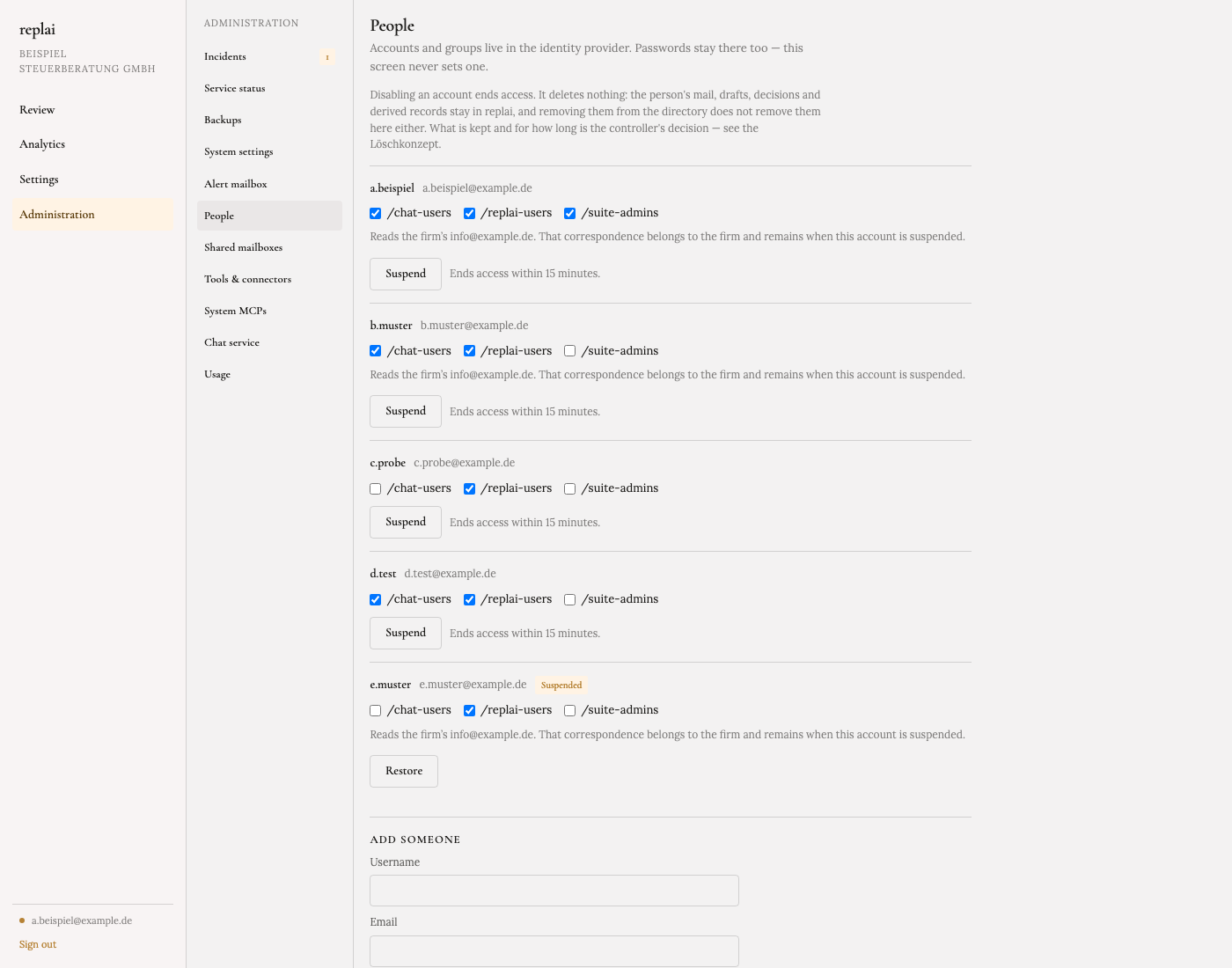
Three ticks per person. May use the chat. May use the e-mail assistant. Is an administrator. That last tick makes someone an administrator of both products at once, and taking it away undoes both. One switch, because two switches for the same idea are how the two drift apart.
Two things on this screen are missing on purpose.
There's no password field. Passwords live only in the sign-in system. This screen never shows one and never sets one, so it can't be used to hand someone else's password to the wrong person.
There's no Delete button. There's Suspend, which ends someone's access, and Restore, which gives it back. Deleting a person's history is a legal decision about what the firm keeps and for how long, and it belongs in the firm's deletion policy, not behind a button. The screen says so at the top, in a full sentence.
And next to every Suspend button, the screen lists the shared mailboxes that person reads, with one line: that correspondence "belongs to the firm and remains when this account is suspended". It looks like a small detail. Without it, an administrator could reasonably believe suspending someone takes their mail with them, and go looking for a way to "clean up" the shared inbox. That line exists so nobody ever does.
Who reads the firm's shared mailboxes
Most firms answer some mail from shared addresses, like info@ or
rechnungen@. Several people read them, and who they are changes with
holidays and roles.
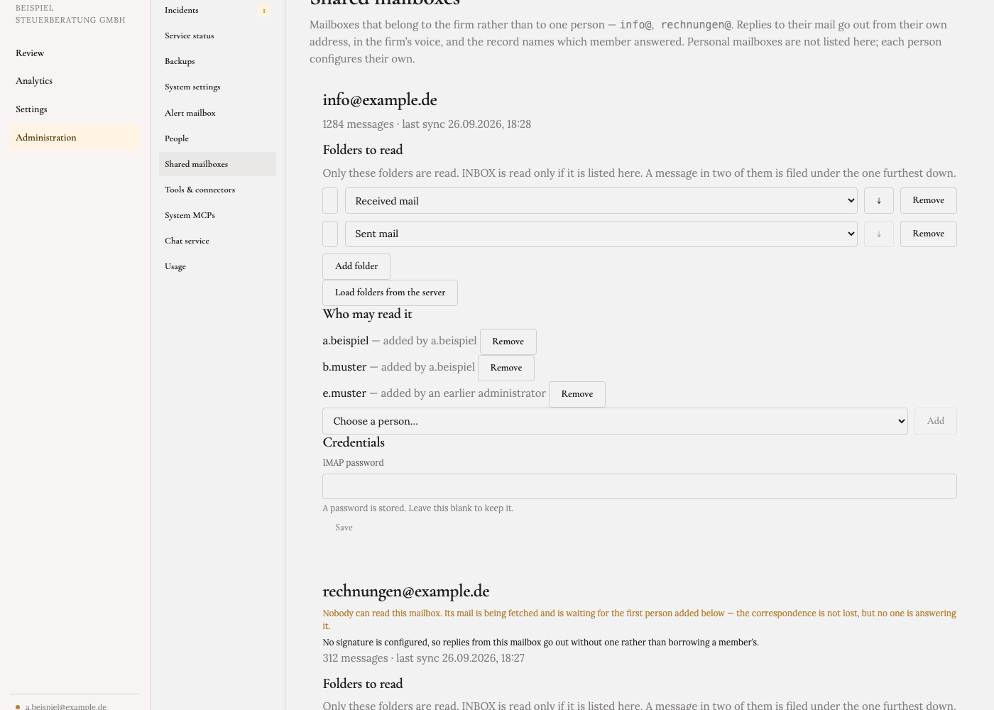
Access to a shared mailbox is always given by name. I could have let everyone
at the firm read info@ by default, and decided against it. It's the firm's
correspondence with its clients, and whether every employee should read it is
the firm's decision, not mine.
The screen remembers who added whom, and keeps that record even after the administrator who did it has left. And it warns in the accent colour when a mailbox has no readers at all. Mail keeps arriving and is safely stored, but nobody is answering it. That's exactly the kind of situation nobody notices until a client calls to complain, so the screen notices first.
For the colleague, a mailbox they weren't given is simply absent. They don't see a locked door with the firm's clients' names on it. They see nothing.
Some things nobody should change with a click
A few settings decide what the whole product is: which AI models it may use, how long chat conversations are kept, how people sign in, which tools the chat is allowed to use. Those were agreed with the firm when the system was set up, and some of them are written into its data protection documents.
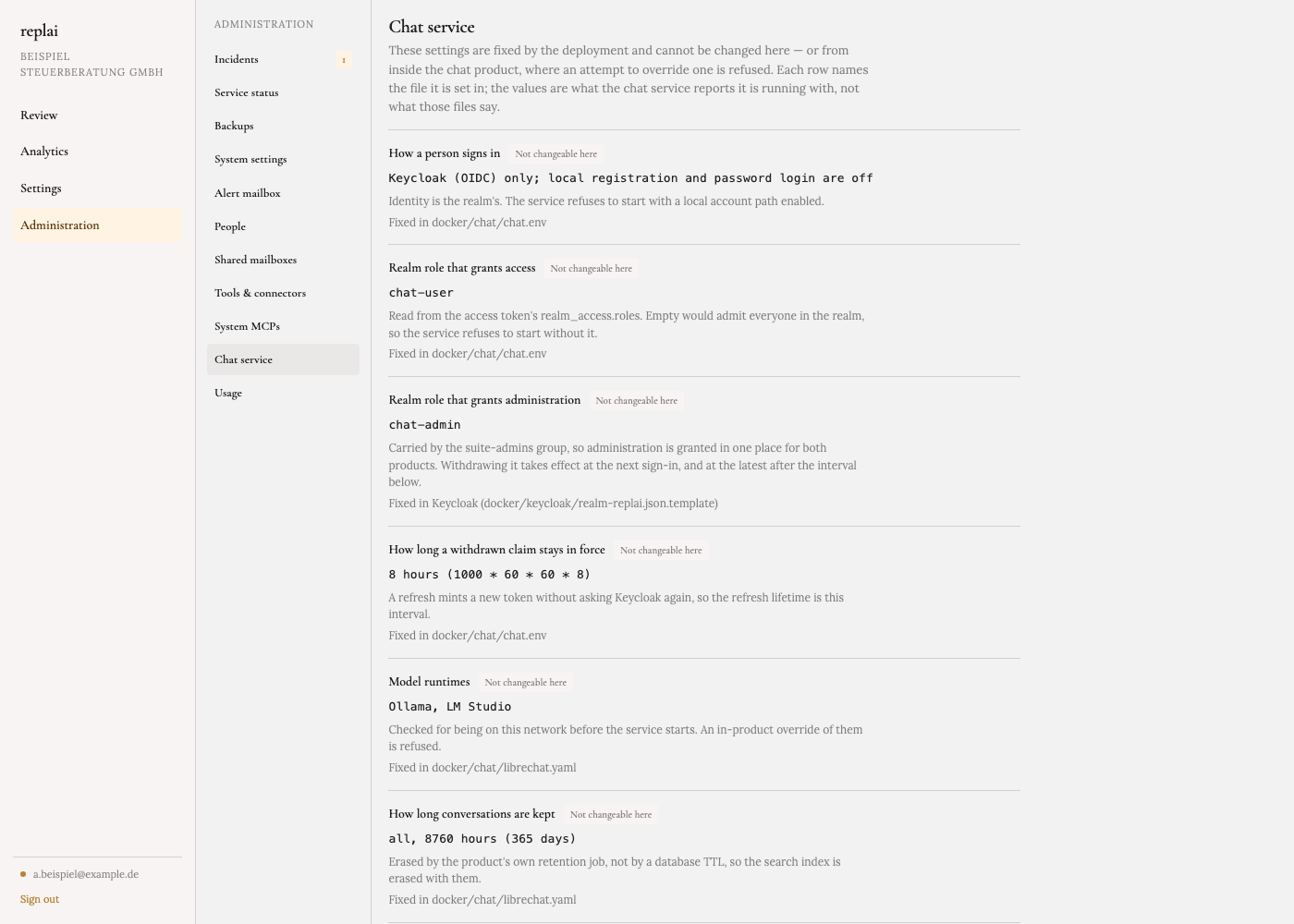
So the administrator can see them, each with a sentence explaining what it means, marked "Not changeable here". Not hidden, because a setting you can't see is one you can't ask about. Not editable, because changing how long the firm keeps conversations shouldn't be something that happens by accident on a Thursday afternoon. Changing them is a deliberate step, taken when the software is updated.
What even an administrator can't see
One screen shows how the firm uses the product overall. How many suggested replies were accepted, how much people changed them before sending. It exists so someone can decide whether the product is worth its place.
It will never show those numbers for one person. There's no way to pick a colleague, and a figure is hidden entirely when fewer than five people are behind it, so a small team can't be singled out either. The firm gets to judge the product. It doesn't get a tool for watching its staff, and in Germany that's also a question for the works council, which this design keeps small.
Why it looks like this
A word on the design, because it isn't decoration.
All of this lives inside the product, not in a separate admin tool. Same sign-in, same address, the same warm paper background, serif type and brass accent as the screens people use every day. An administrator should never feel dropped into a different, more dangerous piece of software. It's the same product with a few more responsibilities, and it looks like it.
Every screen opens with a sentence saying what it can and can't do. "This screen never sets one." "It deletes nothing." Statuses are written as words, not just colours: Suspended, In force, Not changeable here. A colour tells you that something is different. Only a word tells you what.
One thing I found on the way
Near the end of September I asked the running system a simple question: who is an administrator of the chat? The answer was one account, and it wasn't a person. It was the system's own internal helper account, which I had set up by hand to get things working. Nobody at the firm was an administrator of the chat, and there was no proper way for anyone to become one.
That's the problem this whole article is about, in miniature. It's now fixed the way everything else here works: the administrator tick on the People screen decides it, for both products, and there's no second place to set it. And the chat now re-checks with the list at least once per working day. Its software's default was once a week, which meant a removed administrator could keep their rights until the following Monday.
What it's for
The person who looks after this system at the firm isn't a technician, and shouldn't have to become one. These screens are built so that the everyday decisions, who's new, who's left, who covers the inbox, who may search what, take a few ticks and can't go wrong in a way that hurts. And the decisions that could hurt aren't a click away at all.
The screens shown are the real ones, from the version being finished now, with a sample firm and sample people.
Written with AI from my own repositories and notes, reviewed and published by me. How this site is written