notemd · 2026-06-22 · 10 min read
The graph view didn't survive the vault rework, so I rebuilt it as a globe
A while back I reworked how vaults work in notemd. Notes stopped being rows in a database with a parent pointer and became what they always should have been: plain .md files in folders on disk, Obsidian-style. A folder with a same-named Foo.md next to it collapses into one "folder note". Hierarchy is wherever the files are.
It was the right call. It also quietly broke the one feature I was proudest of.
The Knowledge Map was lying
The old graph, the "Knowledge Map", was a left-to-right hierarchy tree drawn with a SwiftUI Canvas inside an NSScrollView. It read the article's parent field to lay out depth, and it found connections by parsing the markdown for notemd://article/UUID links. Sources hung off the right side from notemd://pdf/UUID citations.
Every single one of those assumptions died in the vault rework.
parentwas now a derived cache recomputed from the folder layout, so the graph was drawing a hierarchy that no longer meant anything.- Connections moved to real
[[wikilinks]], stored asLinkEdgerows. The graph was still scraping a link format people had stopped writing. - And the tree layout never scaled anyway. A flat vault of 400 notes became a column tall enough to need a telescope.
So I had a beautiful visualization of a data model that didn't exist. Time to start over.
Build the boring half first
The thing I got right early: I split the whole feature into pure layers that don't import SceneKit and don't touch Core Data, and a rendering layer on top.
RadialGraphSnapshotBuilder.swiftturns the vault tree + wikilinks + citations into plain value-type nodes and edges.RadialGraphAdapter.swiftis the only place that reads Core Data, and it emits only UUIDs and strings.- A layout engine turns that snapshot into positions.
- Only then does a scene builder turn positions into
SCNNodes.
The payoff is that the part most likely to be wrong, the graph's meaning, is testable without a window. "A broken [[link]] produces no edge." "A folder note links to its children, mirroring the sidebar." "Duplicate links collapse into one edge." All of that is a fast unit test, no host app, no pixels.
I'll spoil the ending: every bug that actually shipped was in the other half, the part the tests couldn't see.
The detour through a sunburst
My first instinct was a radial/sunburst, with the project in the center, folders fanning out as wedges, notes on the rings, wikilinks as chords across the circle. I built the whole thing on SceneKit so that "zoom out" could one day become a real 3D map.
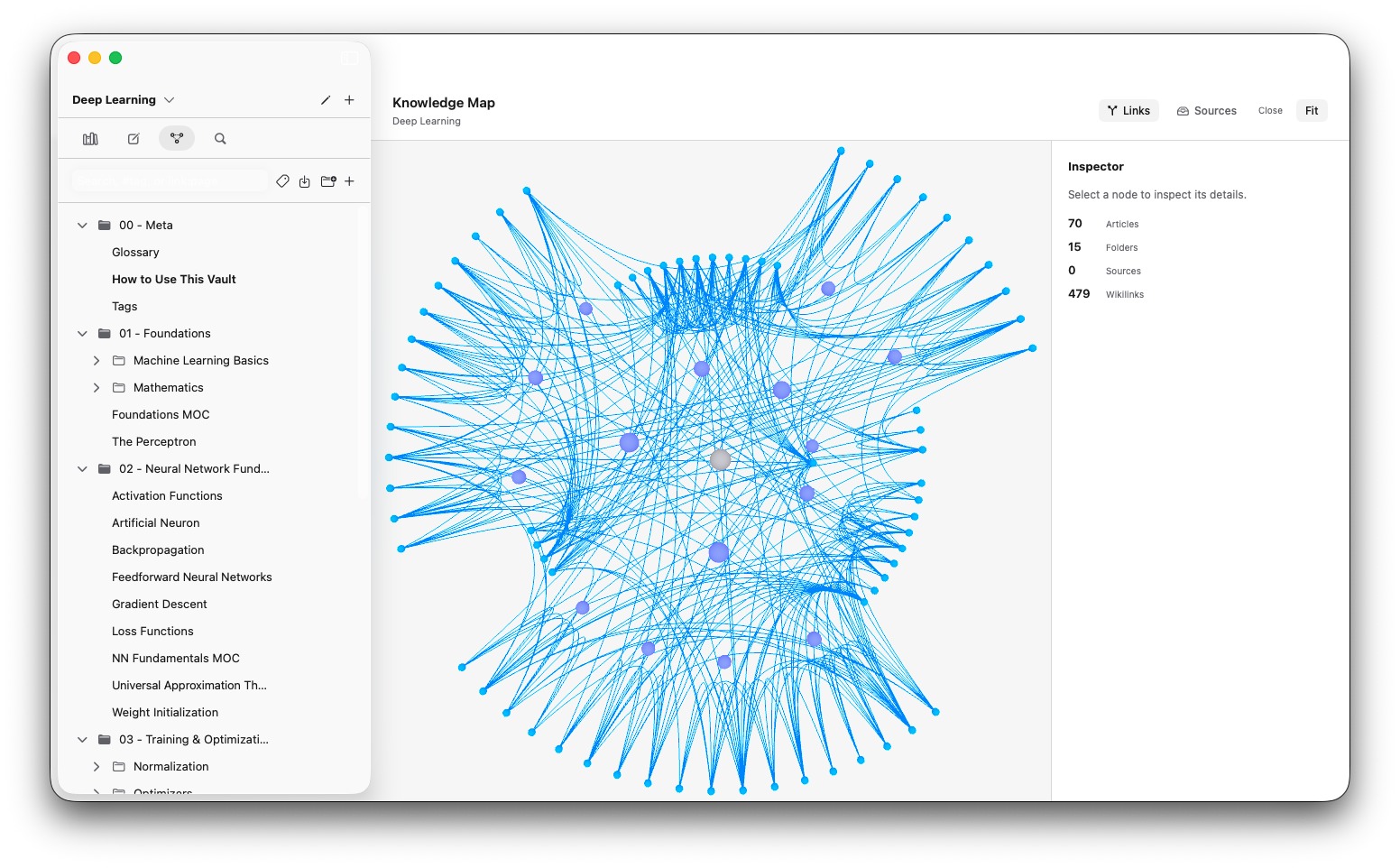
It worked. It was also… fine. A dense, interlinked vault turned into a hairball with a hole in the middle, and the radial structure stopped carrying any information once there were more than a few folders. It was prettier than the tree. It wasn't better.
So I did the thing you're supposed to do and asked what the graph actually wanted to be. The answer was obvious in retrospect: an Obsidian-style force-directed cloud, in 3D, in my own black-and-white colorway. Notes repel each other, links pull them together, and the whole thing finds its own shape.
That meant a new pure engine: ForceDirectedLayoutEngine.swift. A deterministic Fruchterman-Reingold simulation. Repulsion between every pair, spring attraction along edges, seeded from a Fibonacci sphere so the same vault always lays out the same way (and so I could unit-test "connected nodes end up closer than disconnected ones" without any randomness to fight).
"It renders nothing" was three bugs wearing a trenchcoat
Here's the part I'm slightly embarrassed by. I shipped the 3D version, opened a project, switched to the graph, and got… a blank canvas. Every automated test was green. Thirteen clean commits. Nothing on screen.
It turned out to be three independent scale mismatches, any one of which was enough to make it invisible:
- The camera couldn't see the graph.
SCNCameradefaults its far clip plane (zFar) to 100. My camera sat atboundingRadius * 2.2, which for any real graph is 260+ units out. The entire graph plane was behind the far plane and got clipped away. I'd never setzFar, so it was quietly throwing the whole scene in the bin. - The level-of-detail logic hid everything. I had distance tiers, close and mid and far, that faded notes out as you pulled back. The thresholds were
40/120, but a freshly-fit camera starts at hundreds of units, so it opened straight into the "far" tier where note opacity is zero. Even unclipped, every node was fully transparent on the first frame. - No lights. The node spheres used diffuse materials with no light in the scene, so even fixed, they'd have rendered as black dots on a near-white background.
None of those is catchable by a unit test that asserts node counts. They only show up when a real camera looks at a real scene, which is exactly the verification step I'd skipped. Lesson filed under "permanent."
While I was in there I also found that the rotation gestures didn't respond at all. Turns out NSGestureRecognizers attached to an SCNView hosted inside SwiftUI just don't receive events the way the old NSScrollView did. Switching to plain NSResponder overrides (mouseDown/mouseDragged/scrollWheel), the way the old graph already worked, fixed it instantly.
A cloud hides its own nodes
Once it rendered and rotated, a deeper problem showed up, and it's the one I find most interesting.
A force-directed graph fills a volume. Which means a chunk of your nodes are buried in the middle, behind other nodes, unreachable no matter how you orbit. You can see the hairball; you can't touch most of it.
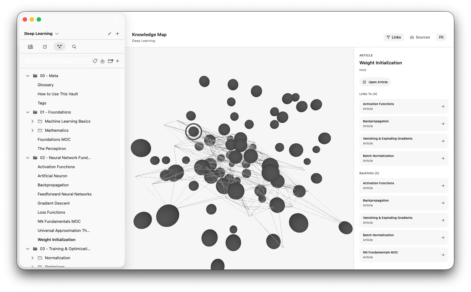
The fix is almost silly once you see it: put the nodes on the surface of a sphere instead of inside one. A hollow globe has no interior, so nothing is ever buried. The front hemisphere is always directly hoverable, and you spin the globe to bring the back around.
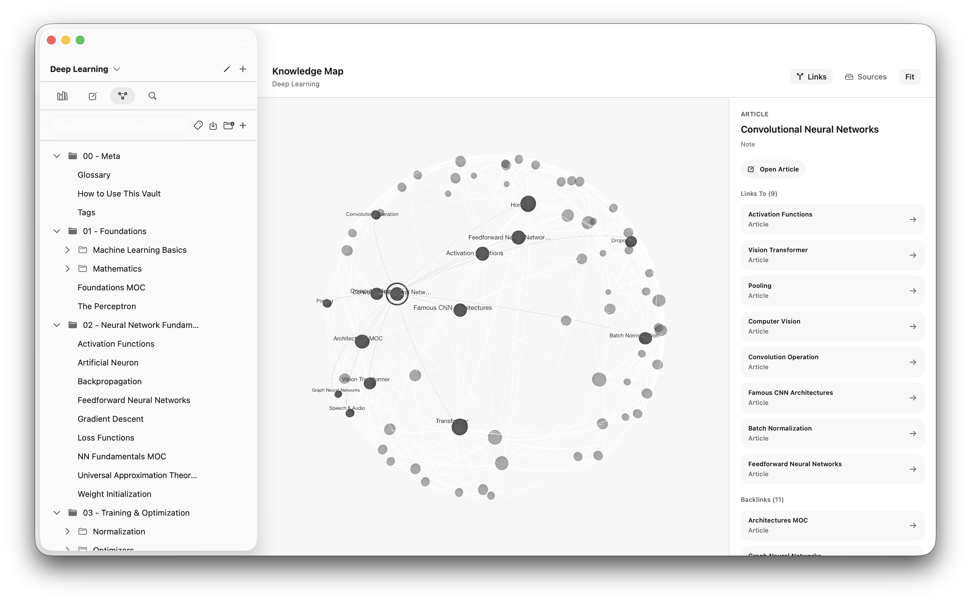
So ForceDirectedLayoutEngine grew a constrainToSphere mode: after each simulation step, every node is re-projected onto a sphere whose radius scales with note count (so spacing stays roughly constant whether you have 40 notes or 4,000). The forces still run in 3D, so linked notes cluster into regions on the globe, little continents of related ideas, while unrelated notes drift into open surface. You keep the meaning and you can reach everything.
The links got the same treatment. Straight chords between two surface points cut through the globe's interior and clutter the far side. So they're drawn as shallow great-circle arcs that hug the surface, lifted about 1.2% off it, like flight paths on a map. Inside of the globe stays clear.
The thousand small things that make it feel right
A graph view lives or dies on feel, and most of that work is invisible in a changelog:
- Rotation is an arcball, not a turntable. You grab the point under your cursor and it sticks to your cursor as you drag, so the surface follows your hand. The camera stays put; the globe spins. (
GraphSceneView.swift, if you want the Shoemake math.) - Nodes are easy to grab even though they're tiny. Instead of demanding a pixel-perfect hit on a 3-unit sphere, hovering finds the nearest node within ~26 points of the cursor, and when front and back overlap it picks the frontmost. Small nodes stopped being a usability tax.
- Hover focus is gentle. Hovering a note brightens it and its neighbours, shows their titles, and lightly fades the rest, to 60% opacity rather than the near-invisible 12% I started with, because "everything vanished" is not a focus mode.
- Labels are lazy. Rendering 470 text labels every frame is a great way to melt a fan, so titles only materialize for the handful of nodes you're actually focused on.
- It's all monochrome, matching the rest of notemd. Nodes are shades of grey by kind, folder notes darker and sources lighter, sized by how many links they have.
And a couple of correctness fixes that mattered more than the polish:
- The force simulation is O(n²) per step, so it runs off the main thread with a generation token to drop stale results, so opening the graph or toggling sources no longer freezes the UI for a second.
- Selecting a note in the sidebar now selects it in the graph too, which the rework had quietly dropped.
- And the one a user caught for me: a plain source citation (
notemd://pdf/UUID) wasn't showing up as an edge at all. The adapter was only readingKnowledgeConnectionrows, but those only exist for typed citations (?rel=...). A normal "cite this source" creates no row. So I went back to parsing the body markdown for every citation URL, the way the old graph did, and now they show up. (RadialGraphAdapter.swift, with a regression test so it can't quietly break again.)
What I'd tell past-me
Two things.
First: don't build a visualization on a data model you're about to change. The old graph wasn't badly written. It was correctly written against a world that stopped existing. If I'd known the vault rework was coming, I'd have pointed the graph at the on-disk hierarchy from day one instead of the parent field.
Second, and this is the one that actually stung: green tests are not a working feature. I had beautiful coverage of the part of the graph that computes what to draw, and zero coverage of the part that decides whether you can see it. Three independent bugs sailed straight through, and the only thing that caught them was the dumb, irreplaceable act of opening the app and looking at it.
The Knowledge Map is a globe now. It spins, it clusters, you can reach every node, and it draws the hierarchy and the links and the sources the way they actually exist on disk. It took a detour through a sunburst and a blank screen to get there, but it finally shows the vault I have, instead of the one I used to have.
Written with AI from my own repositories and notes, reviewed and published by me. How this site is written